Cameron Radmore
6b75654cc2
chore: enforce RTL-friendly logical CSS properties with a linter ( #12491 )
...
Related issue: https://codeberg.org/forgejo/forgejo/issues/8581

This should be a nice first step towards RTL support. Future PRs can look at updating the tailwind classes, changing some of the icons (arrow left might need to become arrow right in some cases for example, and updating the template files)

Reviewed-on: https://codeberg.org/forgejo/forgejo/pulls/12491
Reviewed-by: 0ko <0ko@noreply.codeberg.org>
2026-05-11 00:20:45 +02:00
0ko
d7de47ea23
fix(ui): cleanup css deadcode related to stackable menus ( #11719 )
...
Followup to https://codeberg.org/forgejo/forgejo/pulls/11597#issuecomment-11486785
We only have two stackable menus in the UI:
c1787d06e2/templates/user/dashboard/navbar.tmpl (L2)c1787d06e2/web_src/js/components/DashboardRepoList.vue (L328)https://codeberg.org/forgejo/forgejo/pulls/11719
Reviewed-by: Gusted <gusted@noreply.codeberg.org>
Co-authored-by: 0ko <0ko@noreply.codeberg.org>
Co-committed-by: 0ko <0ko@noreply.codeberg.org>
2026-03-17 18:45:50 +01:00
panc
b921d5bdb3
fix(ui): fix dashboard some style issues ( #11461 )
...
1. Remove excess left and right margins
2. Remove excess bottom margin
3. Fixed the missing top rounded corner when repo is 0
| Before | After |
|----|----|
|  |  |
|  |  |
|  |  |
Co-authored-by: 0ko <0ko@noreply.codeberg.org>
Reviewed-on: https://codeberg.org/forgejo/forgejo/pulls/11461
Reviewed-by: 0ko <0ko@noreply.codeberg.org>
Co-authored-by: panc <pan0xc@foxmail.com>
Co-committed-by: panc <pan0xc@foxmail.com>
2026-03-02 05:04:57 +01:00
0ko
ec35eb2506
feat(ui): welcome screen for user dashboard ( #7030 )
...
It is shown when there's no activity in the feed.
This is a partial implementation of https://github.com/go-gitea/gitea/pull/32990 .
Differences:
* drawer icon instead of package icon
* h2 instead of h3
* explore links include a link to organizations list
* explore links are hidden for hidden explore sections
* locales are in JSON, I think it's the time to start using it, the hint is simpler and doesn't lie about following users to get their updates in the feed, which isn't a feature yet
* hint uses general hint color instead of input placeholder color
* the large icon still uses placeholder color, but I think it's ok
Things to improve later:
* use 24px variant of icon. This will require reworking `tools/generate-svg.js`
* the vue part wasn't ported, but it'd be also nice to have
Inspired-by: Kerwin Bryant <kerwin612@qq.com>
Reviewed-on: https://codeberg.org/forgejo/forgejo/pulls/7030
Reviewed-by: Michael Kriese <michael.kriese@gmx.de>
2025-02-23 08:41:31 +00:00
0ko
a4f1d0bc43
fix(ui): prevent uppercase in header of dashboard context selector
2024-08-04 16:10:15 +05:00
silverwind
3e53c51903
Pulse page improvements ( #30149 )
...
1. add border-radius and spacing to bars
2. use tailwind background classes
3. Add more space around activity list headers
<img width="983" alt="Screenshot 2024-03-27 at 23 40 54"
src="https://github.com/go-gitea/gitea/assets/115237/70f72c30-e69f-4ecb-882f-32b8bc94d638 ">
<img width="1020" alt="Screenshot 2024-03-27 at 23 41 02"
src="https://github.com/go-gitea/gitea/assets/115237/a35dbbda-515c-40b0-938a-d759f9686b8e ">
(cherry picked from commit 6999a88fd9bef6baa0a8cc5f63e419079611fc9b)
2024-04-21 11:08:33 +02:00
silverwind
8bc4c1c9b0
Remove fomantic label module ( #30081 )
...
Of note is the CSS has references to "floating label" and "transparent
label" but I could not find those anywhere in the code. They are related
to https://github.com/go-gitea/gitea/pull/3939 , but I think these have
long been removed.
---------
Co-authored-by: delvh <dev.lh@web.de>
Co-authored-by: Giteabot <teabot@gitea.io>
(cherry picked from commit 643e6b09587a89dba1f6b58ae21e5d0e7cfd9776)
Conflicts:
web_src/css/base.css
trivial context conflict
2024-03-30 07:17:31 +01:00
silverwind
1ee494a045
[Port] gitea#29982 Introduce .secondary-nav and handle .page-content spacing universally
...
Fixes: https://github.com/go-gitea/gitea/issues/29981 . Introduce
`.secondary-nav` as a universal way for styling and margin adjustments
inside `.page-content`.
If the first child of `.page-content` is `.secondary-nav`, we add margin
below it, otherwise we add padding to the first child. Notable changes:
- `--color-header-wrapper` is replaced with `--color-secondary-nav-bg`.
- `navbar` class is removed.
Co-authored-by: Giteabot <teabot@gitea.io>
Co-authored-by: wxiaoguang <wxiaoguang@gmail.com>
---
Conflict resolution: Trivial conflict & changed selector to reflect new
classes.
Ref: https://codeberg.org/forgejo/forgejo/issues/2776
(cherry picked from commit 3ccda41a539b8ba7841919ee12dc2877ddc03818)
2024-03-28 16:43:09 +01:00
silverwind
165182a92d
Remove the negative margin from .page-content ( #29922 )
...
The negative margin was suboptimal and presents a few unnecessary
challenges while styling the page. Remove it and add custom margin
values, which slightly changes the height a few things near the top of
the page as well:
15px less height of explore and login navbar:
<img width="899" alt="Screenshot 2024-03-20 at 00 52 34"
src="https://github.com/go-gitea/gitea/assets/115237/72a01ca4-5d17-4a0f-b915-61f95054fcb1 ">
15px reduced padding-top height of "user bar" and equal 4px padding
added:
<img width="484" alt="Screenshot 2024-03-20 at 00 52 50"
src="https://github.com/go-gitea/gitea/assets/115237/a8507e6d-372d-4a8b-9048-66fcf8a5facd ">
3px less padding on top of repo:
<img width="552" alt="Screenshot 2024-03-20 at 00 53 49"
src="https://github.com/go-gitea/gitea/assets/115237/dede6e44-7688-440f-a1b6-13532638ae03 ">
(cherry picked from commit 8cad44f4109b6f87e565d43e137e99ab23b54349)
2024-03-26 19:04:26 +01:00
0ko
faa6cb62f7
Fix gaps for org homepage tabs
2024-03-10 19:32:58 +05:00
puni9869
0989f437df
Dashboard context dropdown position fix on landing page in mobile view. ( #27047 )
...
as title.
Screensots
before

after

2023-09-13 15:15:36 +08:00
silverwind
9b76df53dc
Minor dashboard tweaks, fix flex-list margins ( #26829 )
...
Some small dashboard tweaks:
- Remove margin-bottom from divider so first item does not appear to
have un-equal margins
- Restore previous icon color
- Add slight margin-right to icon
Before:
<img width="783" alt="Screenshot 2023-08-31 at 00 10 28"
src="https://github.com/go-gitea/gitea/assets/115237/b75f70d7-8704-4afb-866d-fea0484c52d4 ">
After:
<img width="783" alt="Screenshot 2023-08-31 at 00 10 08"
src="https://github.com/go-gitea/gitea/assets/115237/50ed0c47-6f7c-449e-a054-13091369d43f ">
---------
Co-authored-by: wxiaoguang <wxiaoguang@gmail.com>
2023-08-31 21:28:45 +00:00
delvh
dca2f9371d
Unify border-radius behavior ( #26770 )
...
## Changes
- no more hardcoded `border-radius`es (apart from `0`)
- no more value inconsistencies
- no more guessing what pixel value you should use
- two new variables:
- `--border-radius-medium` (for elements where the normal border radius
does not suffice)
  - `--border-radius-circle` (for displaying circles)

---------

Co-authored-by: silverwind <me@silverwind.io>
2023-08-28 19:43:59 +00:00
wxiaoguang
e4b2bdfbc0
More improvements for the "flex list" and the dashboard list ( #26675 )
...
Follow #26649 and #25790 and add one more example (text truncate) in the devtest page
2023-08-23 04:23:30 +00:00
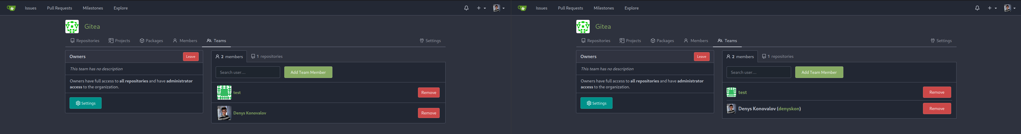
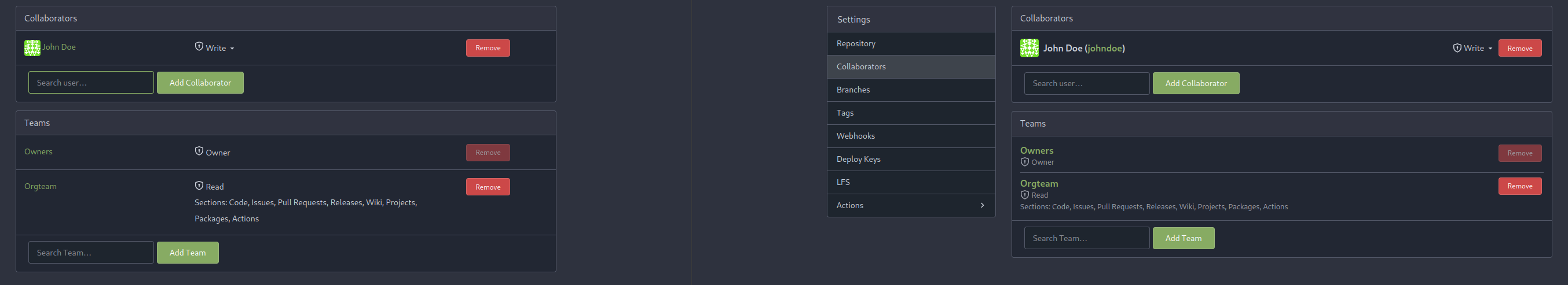
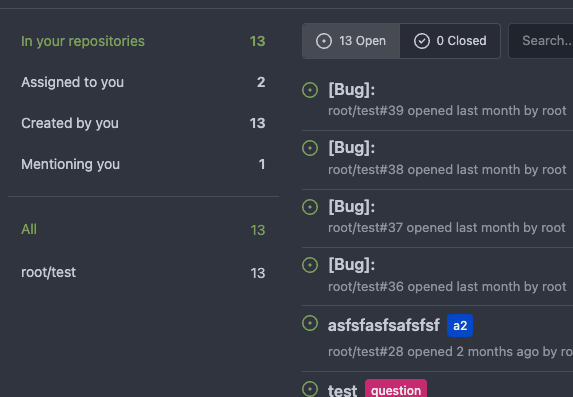
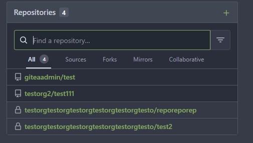
Denys Konovalov
b9baed2c74
Introduce flex-list & flex-item elements for Gitea UI ( #25790 )
...
This PR introduces a new UI element type for Gitea called `flex-item`.
It consists of a horizontal card with a leading, main and trailing part:

The idea behind it is that in Gitea UI, we have many cases where we use
this kind of layout, but it is achieved in many different ways:
- grid layout
- `.ui.list` with additional hacky flexbox
- `.ui.key.list` - looks to me like a style set originally created for
ssh/gpg key list, was used in many other places
- `.issue.list` - created for issue cards, used in many other places
- ...
This new style is based on `.issue.list`, specifically the refactoring
of it done in #25750 .
In this PR, the new element is introduced and lots of templates are
being refactored to use that style. This allows to remove a lot of
page-specific css, makes many of the elements responsive or simply
provides a cleaner/better-looking way to present information.
A devtest section with the new style is also available.
<details>
<summary>Screenshots (left: before, right: after)</summary>


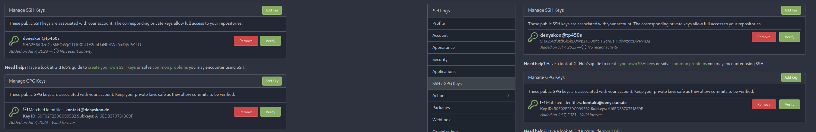


</details>
---------
Co-authored-by: Giteabot <teabot@gitea.io>
2023-08-01 00:13:42 +02:00
silverwind
6a075589bf
Fix mobile navbar and misc cleanups ( #25134 )
...
- Fix and improve mobile navbar layout
- Apply all cleanups suggested in
https://github.com/go-gitea/gitea/pull/25111
- Make media query breakpoints match Fomantic's exactly
- Clean up whitespace in class on navbar items
Mobile navbar before and after:
<img width="745" alt="Screenshot 2023-06-08 at 08 40 56"
src="https://github.com/go-gitea/gitea/assets/115237/ca84b239-b10f-41db-8c06-dcf2b6dd9d28 ">
<img width="739" alt="Screenshot 2023-06-08 at 08 41 23"
src="https://github.com/go-gitea/gitea/assets/115237/09133c54-eb7e-4110-858c-ead23c3b7521 ">
---------
Co-authored-by: wxiaoguang <wxiaoguang@gmail.com>
Co-authored-by: Giteabot <teabot@gitea.io>
2023-06-09 09:10:51 +00:00
wxiaoguang
48bfea6705
Fix incorrect issuel filter menu style ( #25018 )
...
Before:
<details>
</details>
After:
<details>


</details>
2023-05-31 12:44:28 +02:00
silverwind
245f2c08db
Repo list improvements, fix bold helper classes ( #24935 )
...
- Fix bold helper classes that were broken because of CSS syntax error
- Refined the repo list CSS and layout
- Removing bold
- Downsize the mirror icon to fit
- Fix icon positions
- Adapted the org list to match
- Center the '+' icon and mute it
<img width="385" alt="Screenshot 2023-05-25 at 18 38 31"
src="https://github.com/go-gitea/gitea/assets/115237/ac8d6efb-5751-4845-a4ab-db1ddaf36ec3 ">
<img width="384" alt="Screenshot 2023-05-25 at 18 30 29"
src="https://github.com/go-gitea/gitea/assets/115237/bbd39ae7-da9d-4c6f-bfe3-42f28b7a74c3 ">
2023-05-29 16:55:23 +08:00
yp05327
4aec1f87a4
Remove highlight in repo list ( #24675 )
...
Before:
After:

private or internal repos have `lock` icon, no need to add highlights to
them.
2023-05-12 10:00:17 +02:00
Krzysztof Jeziorny
fcad9fd19f
Vertical widths of containers removed ( #24184 )
...
A vertical overflow appears in Firefox 112/MacOS 12.6 when the system
setting for scrollbars is to "Always" show them.
---
Here, the fixed 100vw container widths are removed, which removes the
overflow. It is, however, only simulated in Developer Tools in latest
Firefox and Chromium, so please test on a Gitea installation.
2023-04-19 12:13:00 -04:00
silverwind
202803fc69
Replace Less with CSS ( #23481 )
...
Ran most of the Less files through the Less compiler and Prettier and
then followed up with a round of manual fixes.

The Less compiler had unfortunately stripped all `//` style comments
that I had to restore (It did preserve `/* */` comments). Other fixes
include duplicate selector removal which were revealed after the
transpilation and which weren't caught by stylelint before but now are.

Fixes: https://github.com/go-gitea/gitea/issues/15565
2023-03-14 22:20:19 -04:00